
Translate Plot from R to D3 & from D3 to R
Introduction
It’s a INFO 5100 - Data-Driven Web Applications class mini-project at Cornell University. The task is fast-paced deadline-driven, we need to get experience quickly orienting to a new language and get familiar with both ggplot in R and d3.js. The task is to translate one graph in R to D3/JS, and another graph in D3/JS to R.
You can find the code in my github.
How do you transfer a plot from D3.JS to R?
Data
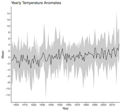
The file noaa-central-park.csv contains more than 120 years of monthly average temperature measurements recorded in Central Park, NYC (source: NOAA).
The variables are the date in a numeric format, the average temperature, and the temperature anomaly, which is the difference between the monthly temperature and the average temperature for that month during the 20th century.
Plot in D3.JS
The plot is the above temperature line chart. The file temperature.html implements a visualization of three year-level summaries of the monthly temperature anomalies: min, max, and mean. Comments in the code identify groups of lines that correspond to R statements.
How to transfer it to R?
First, you need to read csv data, and set Value and Anomaly fields to numbers. As the Date variable will be numbers by auto setting, so we need to set it as a string.
data<- read_csv("noaa-central-park.csv", col_types = cols(
                  Date = col_character(),
                  Value = col_double(),
                  Anomaly = col_double()
                ))
Second, mutate the Date field into a Year field by extracting the first four digits using regular expressions.
data <- data %>%
  mutate(Year = str_extract(Date, "^\\d\\d\\d\\d"))
Third, group all the temperature readings by Year.
temperatures <- data %>% group_by(Year)
Fourth, summarize the year-groups to get their mean, min, and max
yearSummary <- temperatures %>% summarise(
  Mean = mean(Anomaly),
  Max = max(Anomaly),
  Min = min(Anomaly)
)
Last, Add two geometries, a line and then points above the line.
ggplot(yearSummary, aes(Year, Mean, group = 1)) +
  # Add a ribbon geometry showing the span between min and max yearly anomalies.
  geom_ribbon(aes(ymin=Min, ymax=Max, x=Year), fill = "grey80") +
  # Now add a line geometry showing the mean.
  geom_line() +
  # change axis labels
  scale_y_continuous(breaks=seq(-12, 14, 2)) +
  scale_x_discrete(breaks=seq(1900, 2010, 10)) +
  # make background transparent, remove the grid
  theme(panel.grid.major = element_blank(), panel.grid.minor = element_blank(),
        panel.background = element_blank(), axis.line = element_line(colour = "black")) +
  # Add title
  ggtitle("Yearly Temperature Anomalies")
How do you transfer a plot from R to D3.JS?
Data
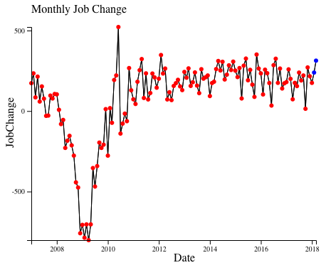
The file bls.txt contains monthly job change numbers from the US Bureau of Labor Statistics.
Plot in R
The file jobs.R creates a visualization of monthly data since 2007, with a line plot overlaid with points that indicate whether a number is preliminary or final.
The plot is:
How to transfer it to D3.JS?
First, write a function to mutate the data:
function mutateRow(row) {
  row["JobChange"] = Number(row["Value"].replace(/\(P\)/i,""));
  row["Preliminary"] = row["Value"].includes("(P)");
  row["Month"] = row["Period"].replace("M","");
  row["Date"] = new Date(row["Year"], row["Month"], '01')
  return row;
}
Second, write a callback function to show the graph:
function callback(error, data) {
  var cutoffDate = new Date('2007-01-01');
  data = data.filter(function(d) {
    return d.Date > cutoffDate;
  })
  var padding = 40;
  // Now create a plot
  var svg = d3.select("svg")
  .attr("height", 300 + 2 * padding).attr("width", 400 + 2 * padding)
  .append("g").attr("transform", "translate(" + padding + "," + padding + ")");

  // Scale the range of the data
  var xScale = d3.scaleTime()
                .domain(d3.extent(data, function(d) { return d.Date; }))
                .range([0, 400]);

  var yScale = d3.scaleLinear()
              .domain( [d3.min(data, d => d.JobChange), d3.max(data, d => d.JobChange)] )
              .range([300, 0]);

  // Add the valueline path.
  var lineGenerator = d3.area()
  .x(d => xScale(d.Date))
  .y(d => yScale(d.JobChange));

  svg.append("path")
  .attr("d", lineGenerator(data))
  .style("stroke", "#000000")
  .style("fill", "none");

  // Add the scatterplot
    svg.selectAll("dot")
        .data(data)
      .enter().append("circle")
        .attr("r", 3)
        .attr("fill", function(d) {
          if (d.Preliminary == true){return "blue";}
          else{return "red";}
        })
        .attr("cx", function(d) { return xScale(d.Date); })
        .attr("cy", function(d) { return yScale(d.JobChange); });

  // Add axes
  svg.append("g").call(d3.axisLeft(yScale).ticks(3));
  svg.append("g").call(d3.axisBottom(xScale).ticks(7))
  .attr("transform", "translate(0," + (300) + ")");

  // Add axis labels
  svg.append("text").attr("transform", "translate(0, -20)").text("Monthly Job Change");
  svg.append("text").attr("transform", "rotate(270) translate(-170, -25)").text("JobChange");
  svg.append("text").attr("transform", "translate(200, 330)").text("Date");
}
Third, read the data and call the above two functions.
d3.csv("bls.txt", mutateRow, callback);